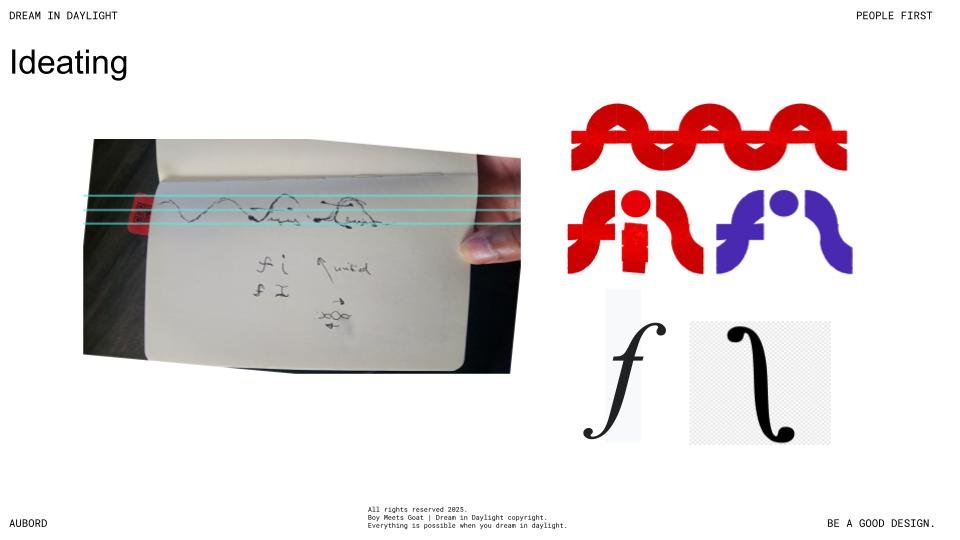
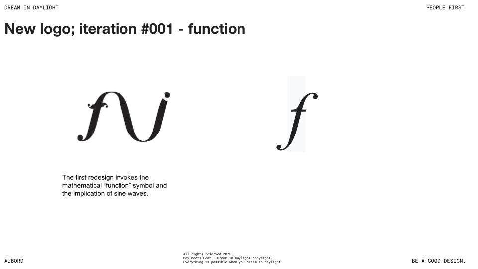
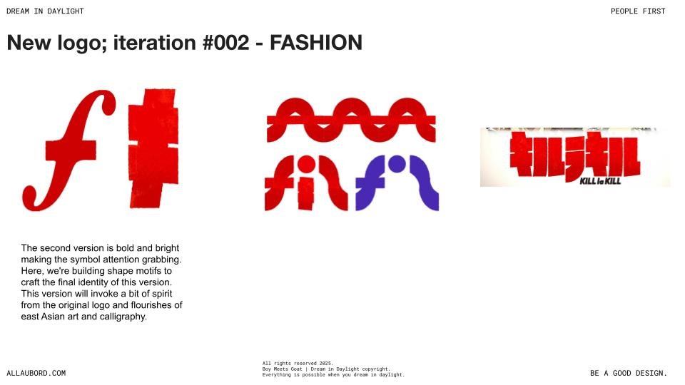
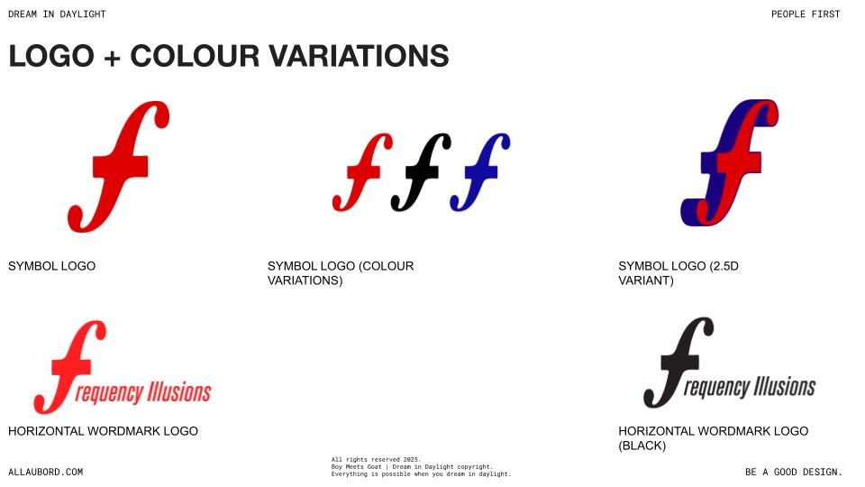
Frequency Illusions came to us with a clear challenge: their brand identity no longer matched the caliber or clarity of their creative output. Originally launched with a placeholder logo, the studio had since evolved into a refined force in multimedia and marketing, blending music, film, and storytelling. Our task was to translate that evolution into a bold, modular visual system—including a new logo and animated bump—that honored their roots while amplifying their future. Drawing from spatial frequency theory, East Asian aesthetics, and the cultural resonance of anime, we delivered a brand mark that’s both iconic and alive in motion—just like their work.